
Create a Custom Color Palette
Create a custom color palette for visualizations and traffic lighting.
As an administrator, you can create custom color palettes for users to apply to visualizations and traffic lighting in the Solution. To create custom color palettes in a project, click Model > Settings > Colors on the navigation bar.
Create a custom palette for visualizations
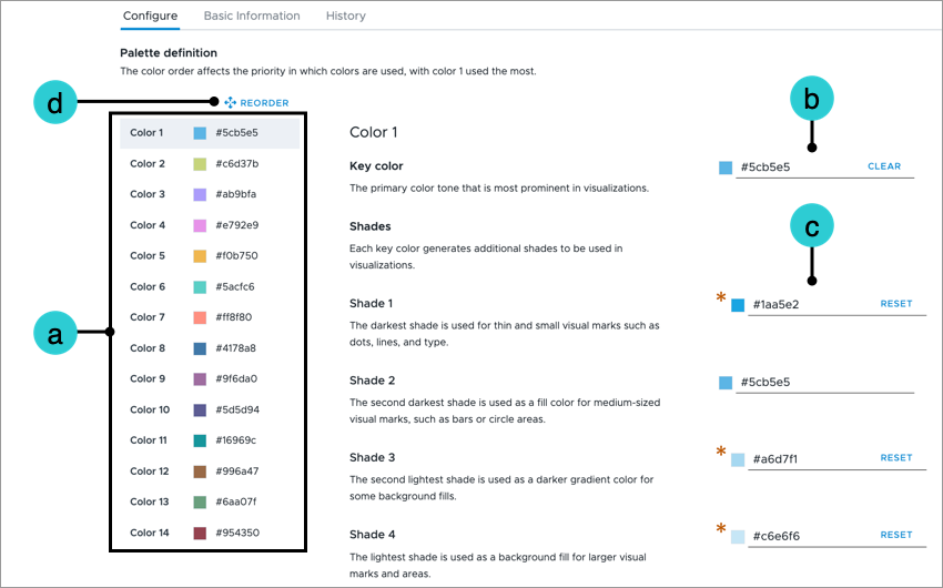
Color palettes allow you to define the colors of visual items such as bars, bubbles, and lines. Each color palette contains a set of 14 colors. The order of colors in the palette dictate the color that is used for visual items as more values are added to the visual.
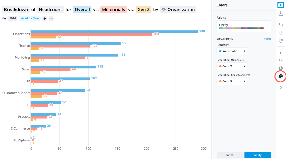
Users can change the color palette for a visual by clicking the Change colors button ![]() on the Visual Actions menu. For more information, see Change Colors.
on the Visual Actions menu. For more information, see Change Colors.
The custom color palettes that you create in Studio appear at the top of the list in the Colors panel once you've published your project changes to production.
Note:
- We recommend that you define as many of the key colors as possible because the palette order will repeat as more items are added to the visual.
- Undefined key colors will be skipped in the palette order. The next defined key color will be used.
- In a project, on the navigation bar, click Model > Settings > Colors.
- In the Color Palettes tab, click Create Custom Palette.
- In the Create Custom Palette dialog, type a display name and description for the color palette, and then click Create.
- Pick colors and build the color palette in the Configure tab.
- Select the color you want to define in the Colors list.
- Click the Key color box to define the primary color tone using the color picker. For more information, see Using the color picker.
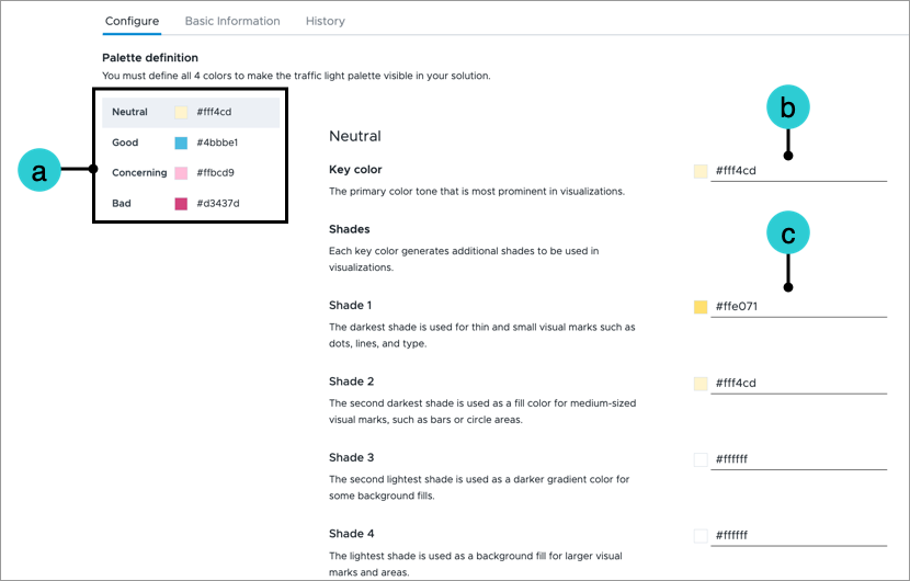
Additional shades will automatically be generated for your key color. These shades will be used for visual marks such as dots and text as well as fill colors for shapes and backgrounds. - Optional: Change the shades for the key color.
Note:
- We strongly advise against changing the shades. Adjusting the automatically generated shades can result in clashing color combinations for visual items.
- If you're making changes to the shades, you should only adjust the saturation and lightness of the shade. Avoid adjusting its hue. For more information, see Best practices for creating color palettes.
- Optional: Change the color order. The color order affects the priority in which colors are used, with Color 1 used the most.
- Click Reorder at the top of the Colors list.
- Drag and drop the colors to the desired position.
- When finished click Save at the top of the Colors list.
- Make the color palette available in the solution experience by selecting Analytics in the Visibility field in the Basic Information tab.
Note:
- Analytics visibility must be selected before you can preview your color palette.
- You can also change this setting from the Color Palettes list.
- To test your color palette, click Preview Solution on the navigation bar.
- Optional: Make the color palette the default color palette for all users from the Color Palettes list. For more information, see Change the default color palette.
-
When finished, publish your project to production.
Create a custom palette for traffic lighting
Traffic lighting uses colors, typically red, amber, and green, to show how values are performing against defined thresholds or targets.
By default, the traffic lighting statuses are linked to the following colors:
- Bad: If the value meets the rule, the visual item will be highlighted in red.
- Concerning: If the value meets the rule, the visual item will be highlighted in amber.
- Good: If the value meets the rule, the visual item will be highlighted in green.
- Neutral: If the value falls outside the range of the defined rules, the visual item will be highlighted in gray. This status cannot be manually assigned to a rule.
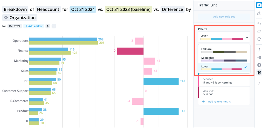
Color palettes allow you to define the colors linked to each status. Users can change the color palette when they define traffic lighting rules by clicking the Traffic light button ![]() on the Visual Actions menu. For more information, see Add Traffic Lighting Rules.
on the Visual Actions menu. For more information, see Add Traffic Lighting Rules.
- In a project, on the navigation bar, click Model > Settings > Colors.
- In the Traffic lighting tab, click Create Custom Palette.
- In the Create Custom Palette dialog, type a display name and description for the color palette, and then click Create.
- Pick colors and build the color palette in the Configure tab.
- Select the status you want to define in the Colors list.
- Click the Key color box to define the primary color tone using the color picker. For more information, see Using the color picker.
Additional shades will automatically be generated for your key color. These shades will be used for visual marks such as dots and text as well as fill colors for shapes and backgrounds. - Optional: Change the shades for the key color.
Note:
- We strongly advise against changing the shades. Adjusting the automatically generated shades can result in clashing color combinations for visual items.
- If you're making changes to the shades, you should only adjust the saturation and lightness of the shade. Avoid adjusting its hue. For more information, see Best practices for creating color palettes.
-
Make the color palette available in the solution experience by selecting Analytics in the Visibility field in the Basic Information tab.
Note:
- Analytics visibility must be selected before you can preview your color palette.
- You can also change this setting from the Color Palettes list.
- To test your color palette, click Preview Solution on the navigation bar.
- Optional: Make the color palette the default color palette for all users from the Color Palettes list. You can only edit the colors of the default traffic lighting palette. It cannot be hidden or deleted. For more information, see Change the default color palette.
-
When finished, publish your project to production.
Using the color picker
Use the color picker to select and apply colors to your palette.
Note: The user interface of the color picker will vary based on the browser you're using. However, each color picker will contain similar elements. The following section uses the color picker in Google Chrome to illustrate these elements.
There are multiple ways you can refine your color selection in the color picker:
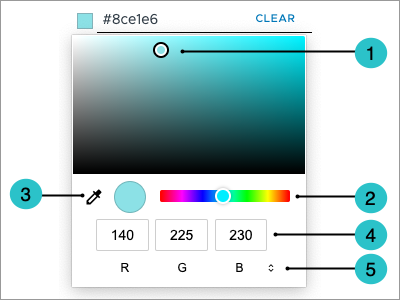
- Color field: Select the color by clicking and dragging the circle in the color field. Use the hue slider to adjust the colors that appear.
- Hue slider: Click and drag the slider left or right to adjust the colors that appear in the color field.
- Eyedropper: Use the eyedropper to select colors from any object or image on your screen. For example, use the eyedropper to extract colors from an image of your company logo. Click the eyedropper and drag the tool outside the browser window to select a color from anywhere on the screen.
- Color value: Type the value for a specific color based on the selected color system.
- Color system: Change the color system that is used. Choose between RGB, HSL, or HEX.
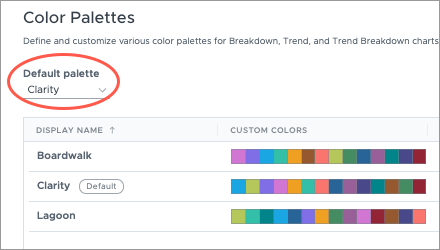
Change the default color palette
Select the color palette that is automatically applied to new visualizations for all users.
Note: Changing the default color palette will not affect existing captures or analysis visuals.
- In a project, on the navigation bar, click Model > Settings > Colors.
- In the Color Palettes or Traffic lighting tab, select the color palette automatically applied to new visualizations in the Default palette list.
-
When finished, publish your project to production.
Edit a color palette
Make changes to an existing color palette.
- In a project, on the navigation bar, click Model > Settings > Colors.
- In the Color Palettes or Traffic lighting tab, select the palette you want to edit.
- Make changes to the color palette.
-
When finished, publish your project to production.
Note:
- The changes you make will be applied to existing captures and analysis visuals that use the color palette.
- If you turn off a color palette that is used in existing captures and analysis visuals, the default color palette will be applied.
- If there is no default set for visualizations, the Clarity color palette will be applied.
- If there is no default set for traffic lighting, the platform's built-in color palette (green, amber, red, and gray) will be applied.
-
You can only edit the colors of the default traffic lighting palette. It cannot be hidden or deleted.
Best practices for creating color palettes
Use the following tips and best practices as guidance when creating your color palettes.
- The easiest way to refine your color choices is by experimenting with the hue, saturation, and lightness values. You can adjust these values by using the HSL (Hue, Saturation, Lightness) color system in the color picker.
- Adjust the hue, saturation, and lightness values to generate distinctiveness between the key colors in your palette:
- Adjust the hue (color family such as Yellow or Blue) to make colors look different.
- Adjust the saturation and lightness to change the intensity of the color.
- Avoid highly saturated colors that will overwhelm other visual items.
- Avoid colors with low saturation and high luminosity. These colors will be hard to see against a light background.
- Keep in mind that a darker shade (Shade 1) will automatically be generated when selecting the key color. Try to leave a bit of room for the key color to get more intense.
- To make it easier for users to distinguish the different colors in your palette, we recommend that you use a range of hues in your palette instead of making subtle changes to saturation or lightness. Colors using similar hues with different saturation and lightness may be perceived by viewers as shades of the same color rather than distinct colors.
- Remember we don't perceive colors in the same way! We recommend that you use an online color palette checker to ensure your color palette is inclusive and friendly for those with color deficiencies.